LANETA TEQUILA
—
—
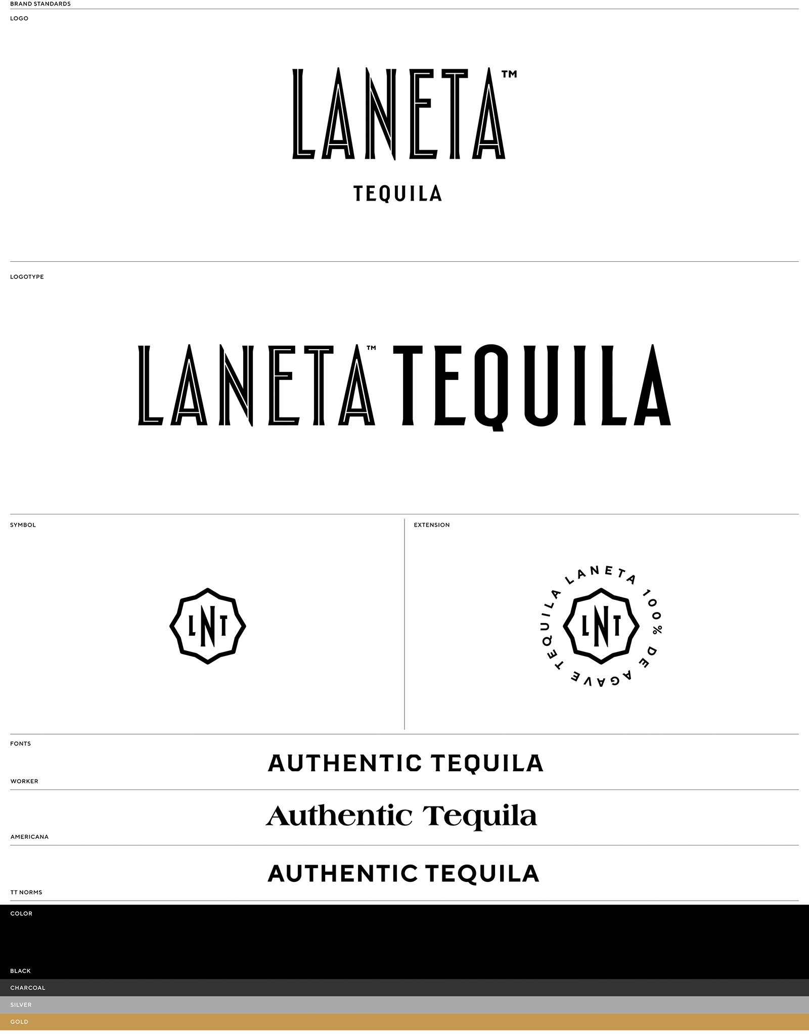
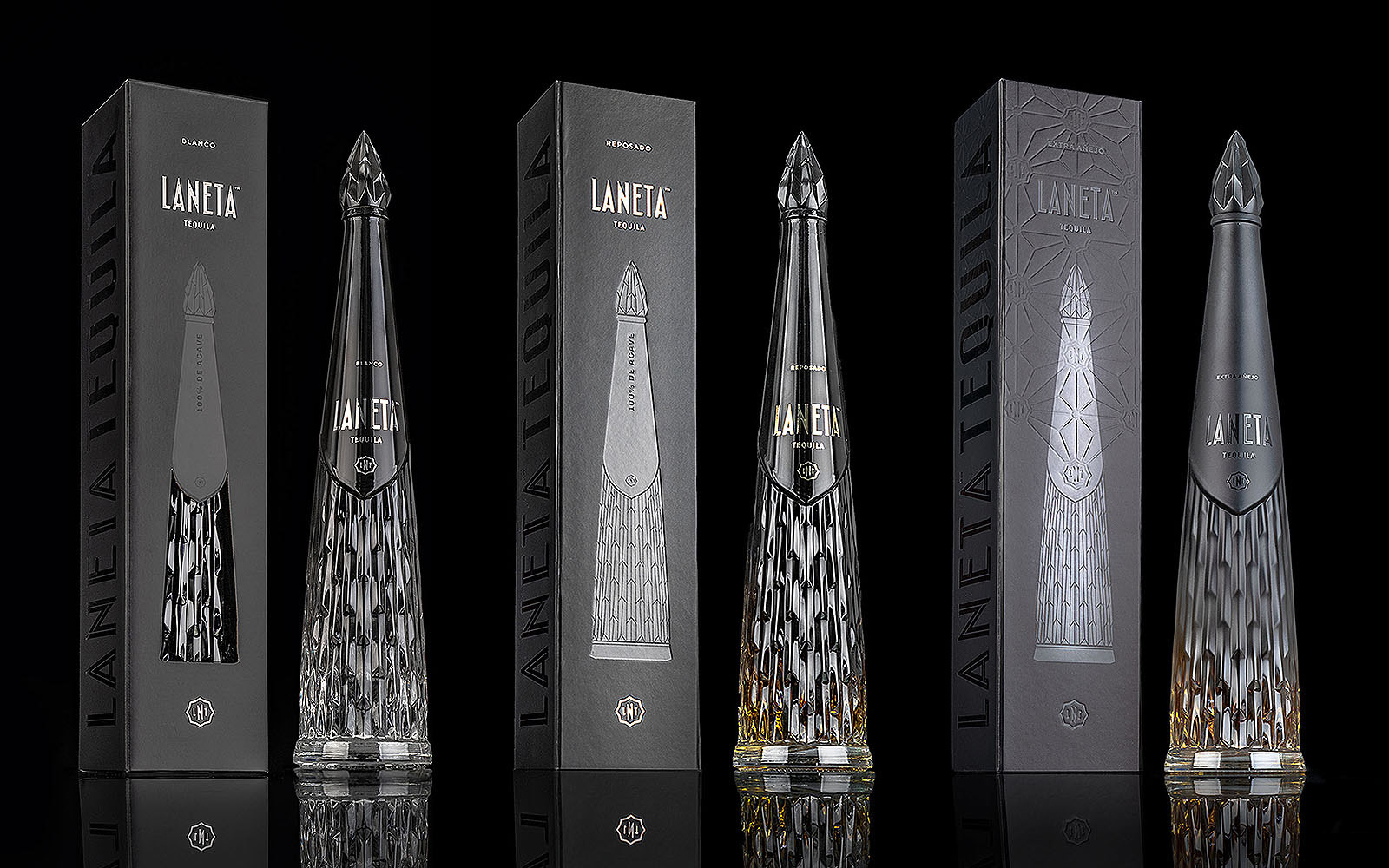
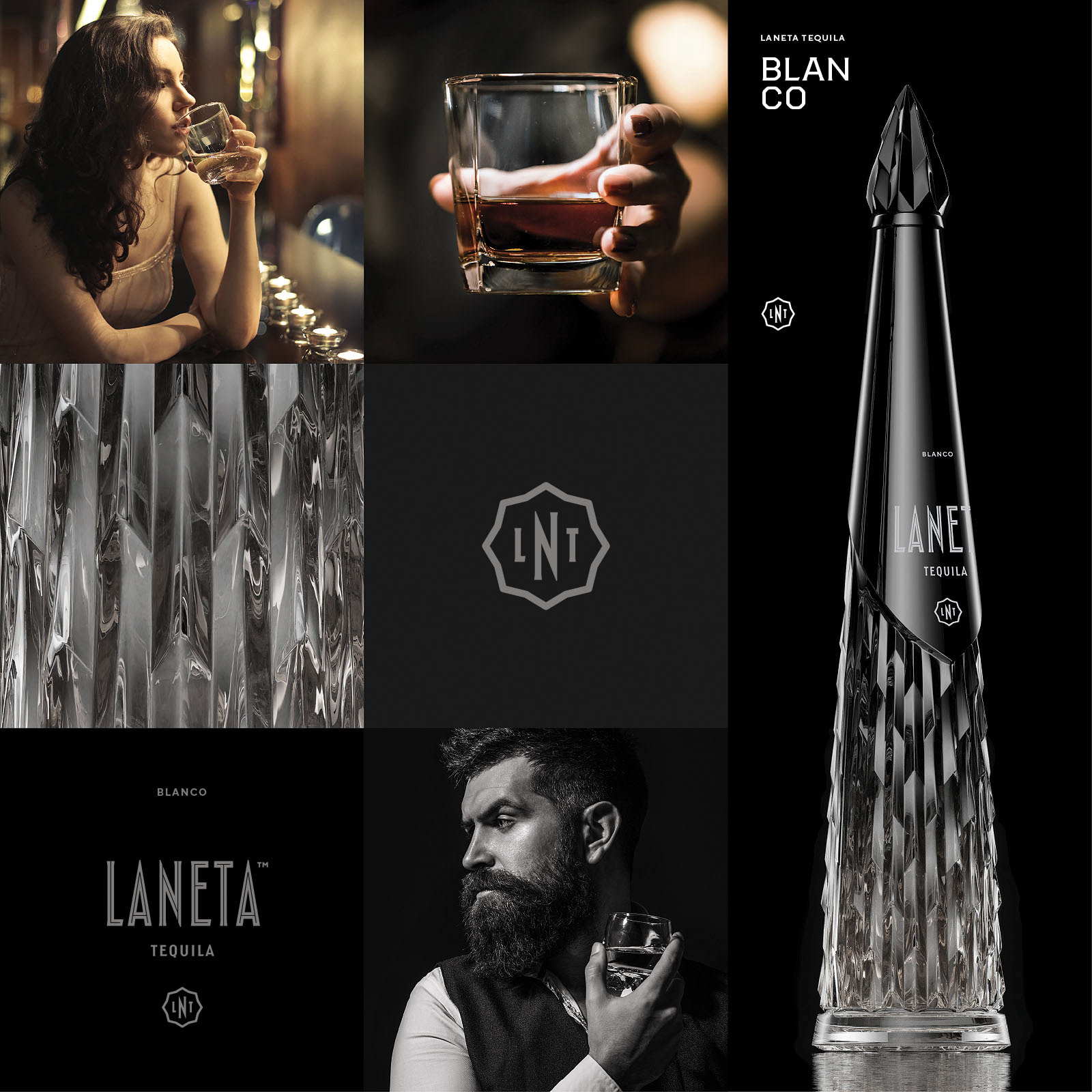
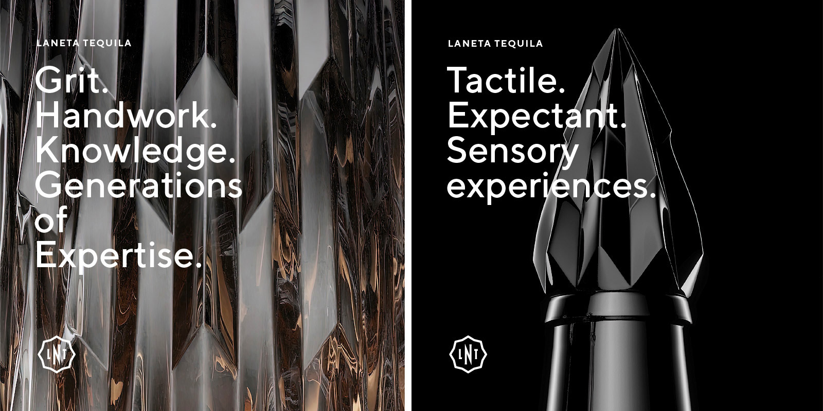
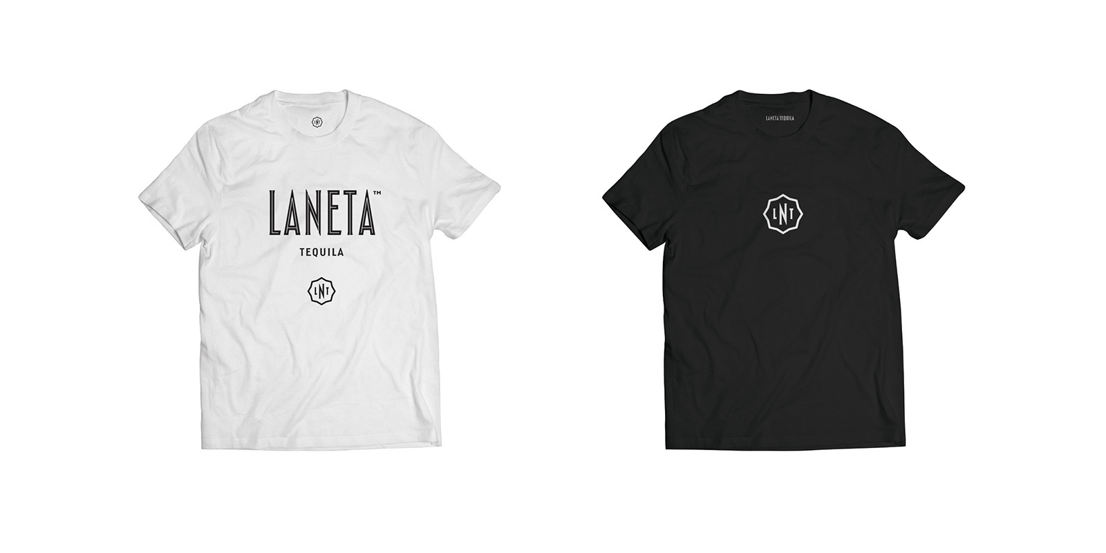
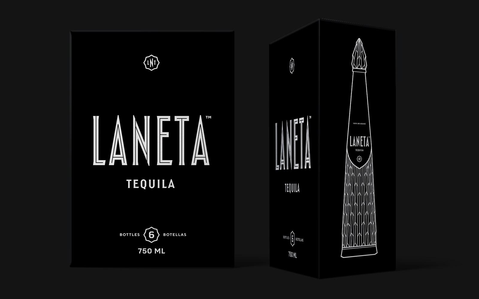
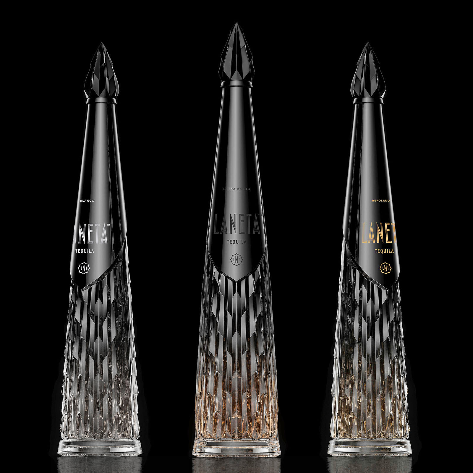
A long-time friend and client asked us to brand his new venture — tequila. He had a bottle design, a vision for a black gradient and a name, La Neta (The Truth). Our task was to give the brand life — messaging, purpose and meaning — and launch in New York City. We provided a strategic design approach to telling their unique story, for their use of keywords and language, and their selection of images, colors, font styling, patterns, and illustration. These standards were applied across digital and print activations such as web, brochure and packaging.
Strategy
Messaging
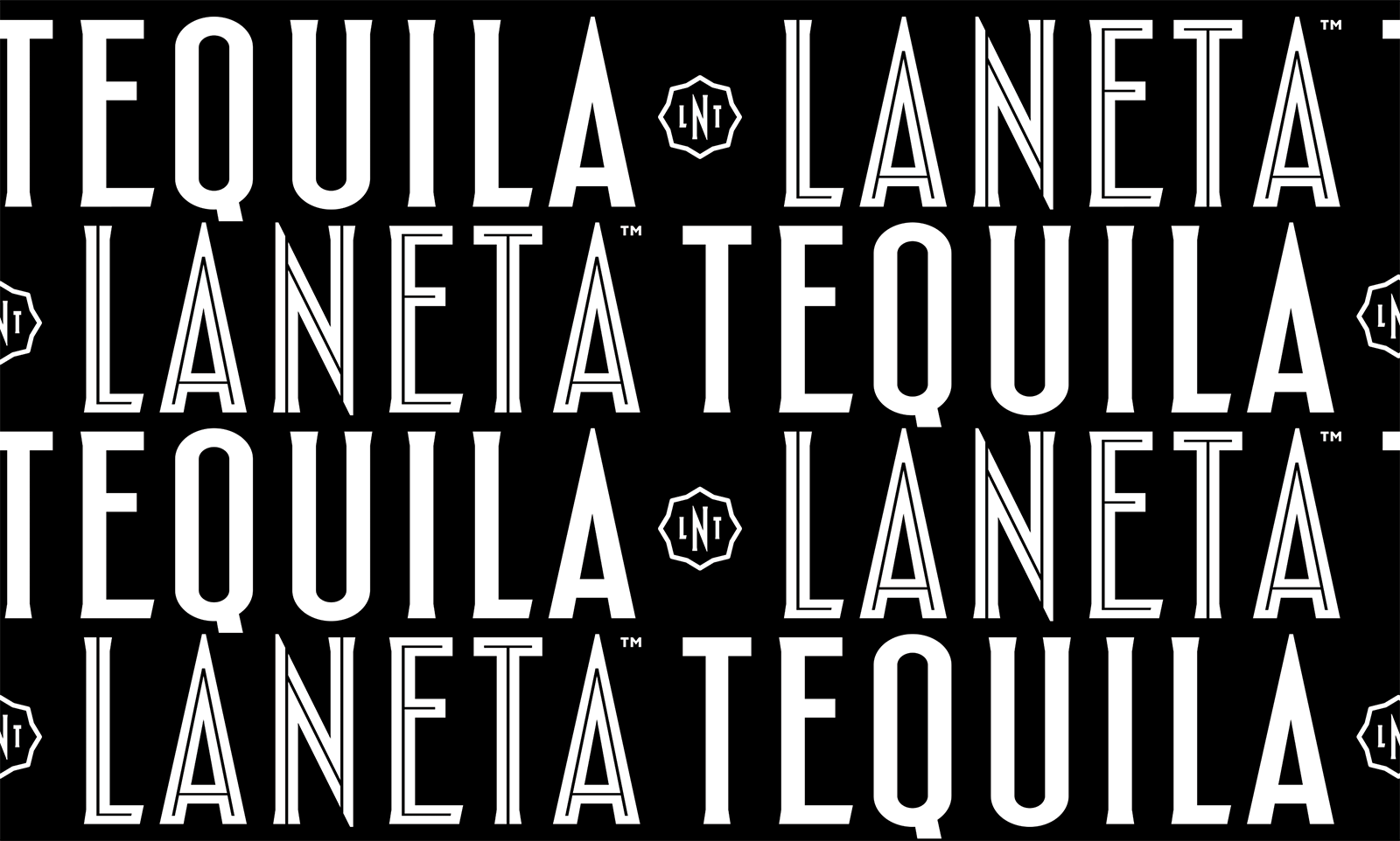
Identity
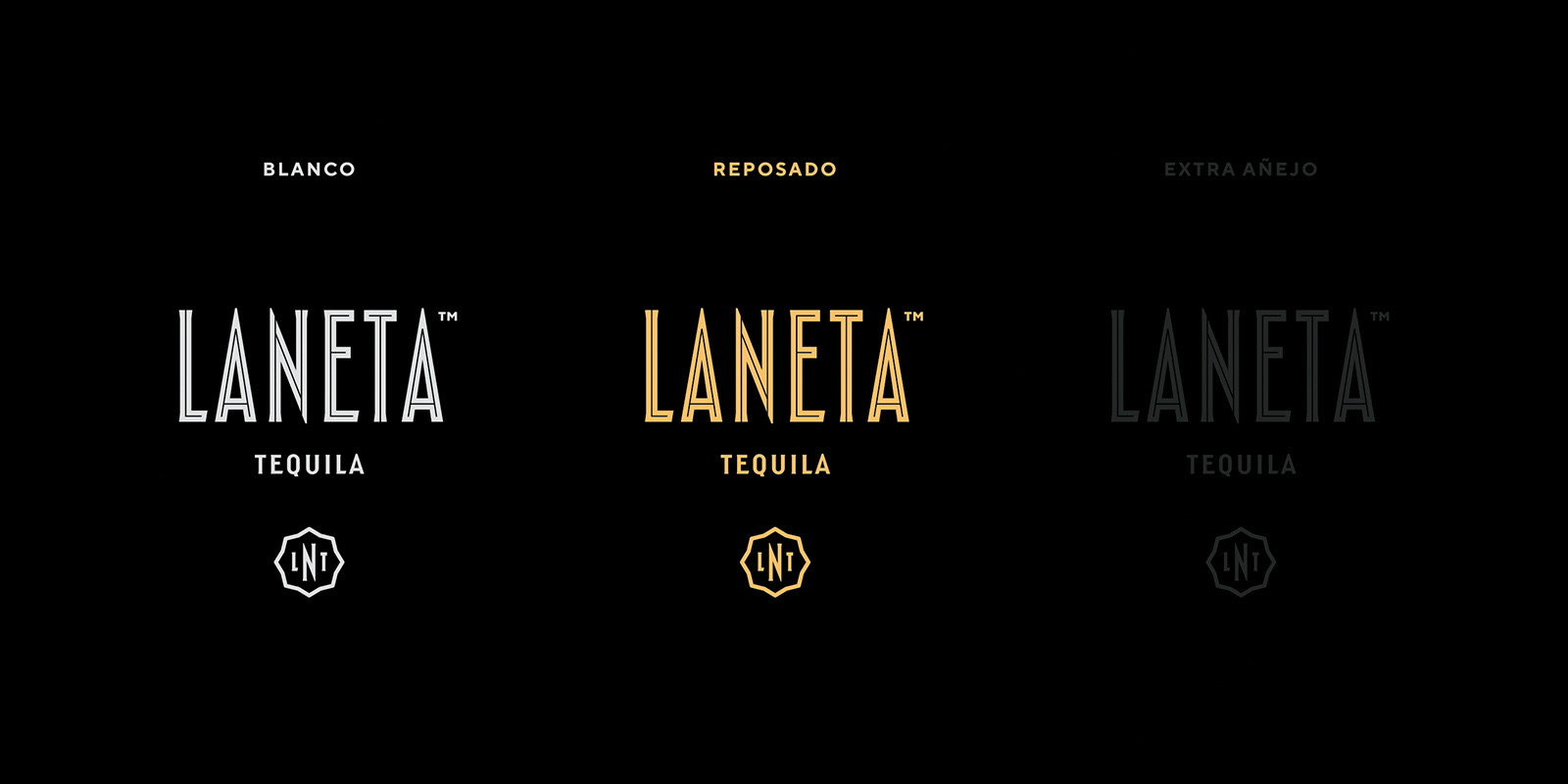
Visual Identity System
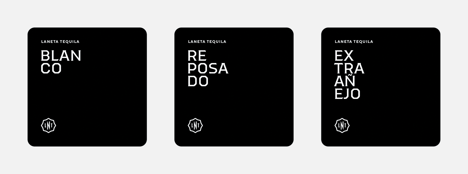
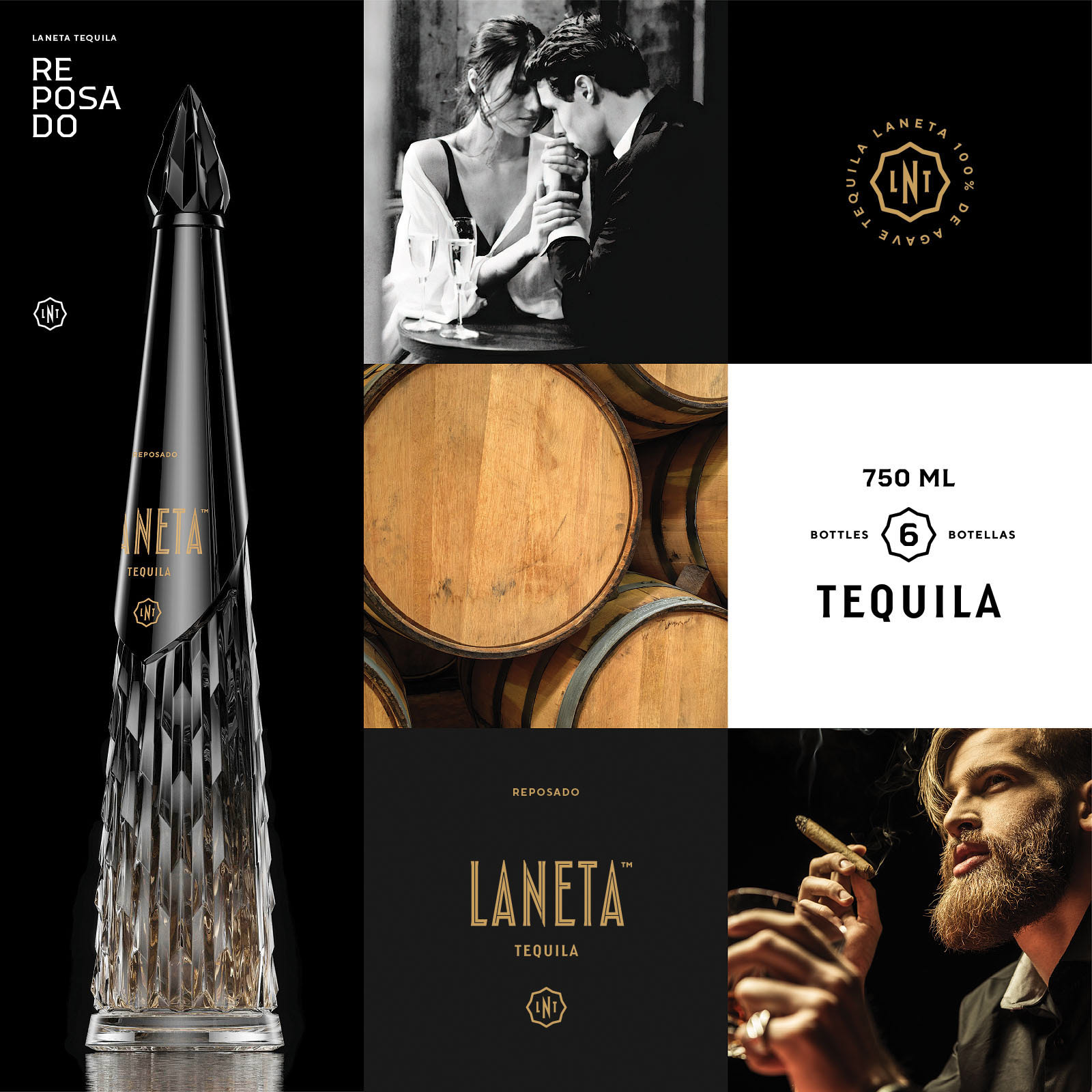
Packaging
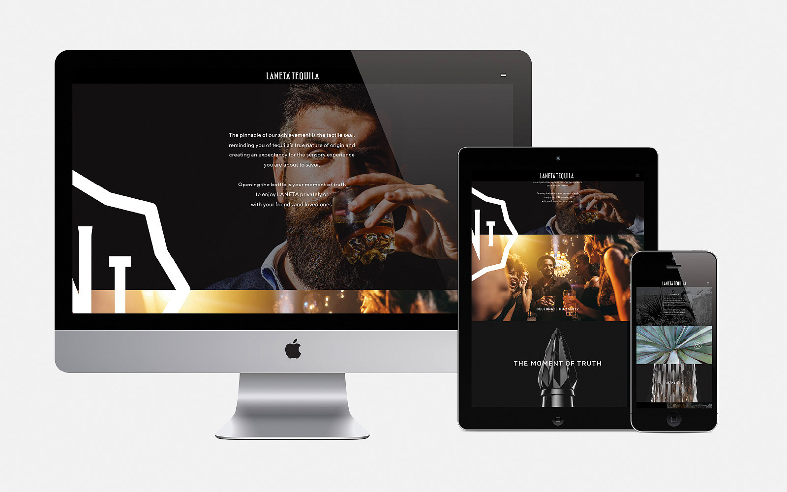
Web
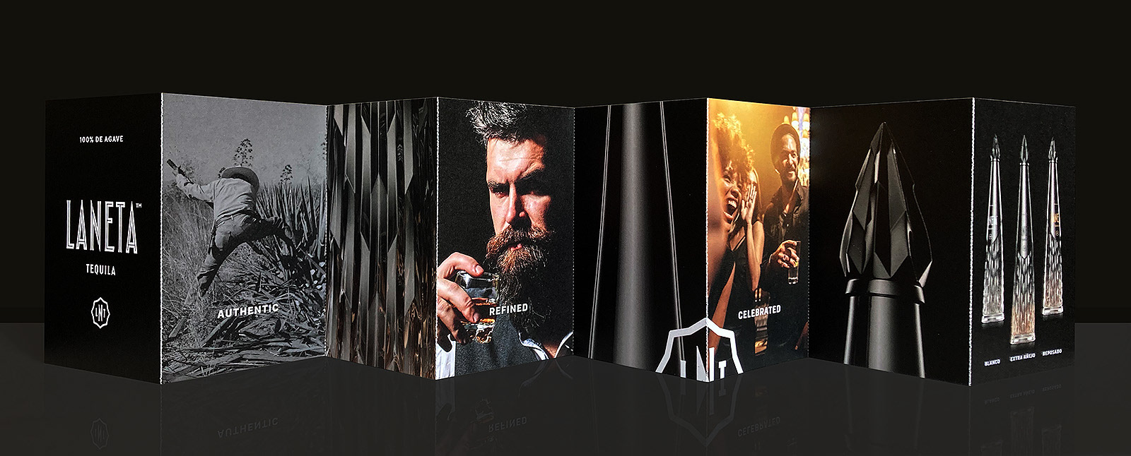
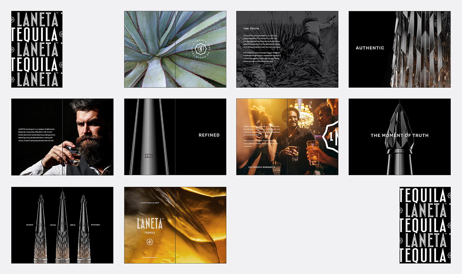
Brochure
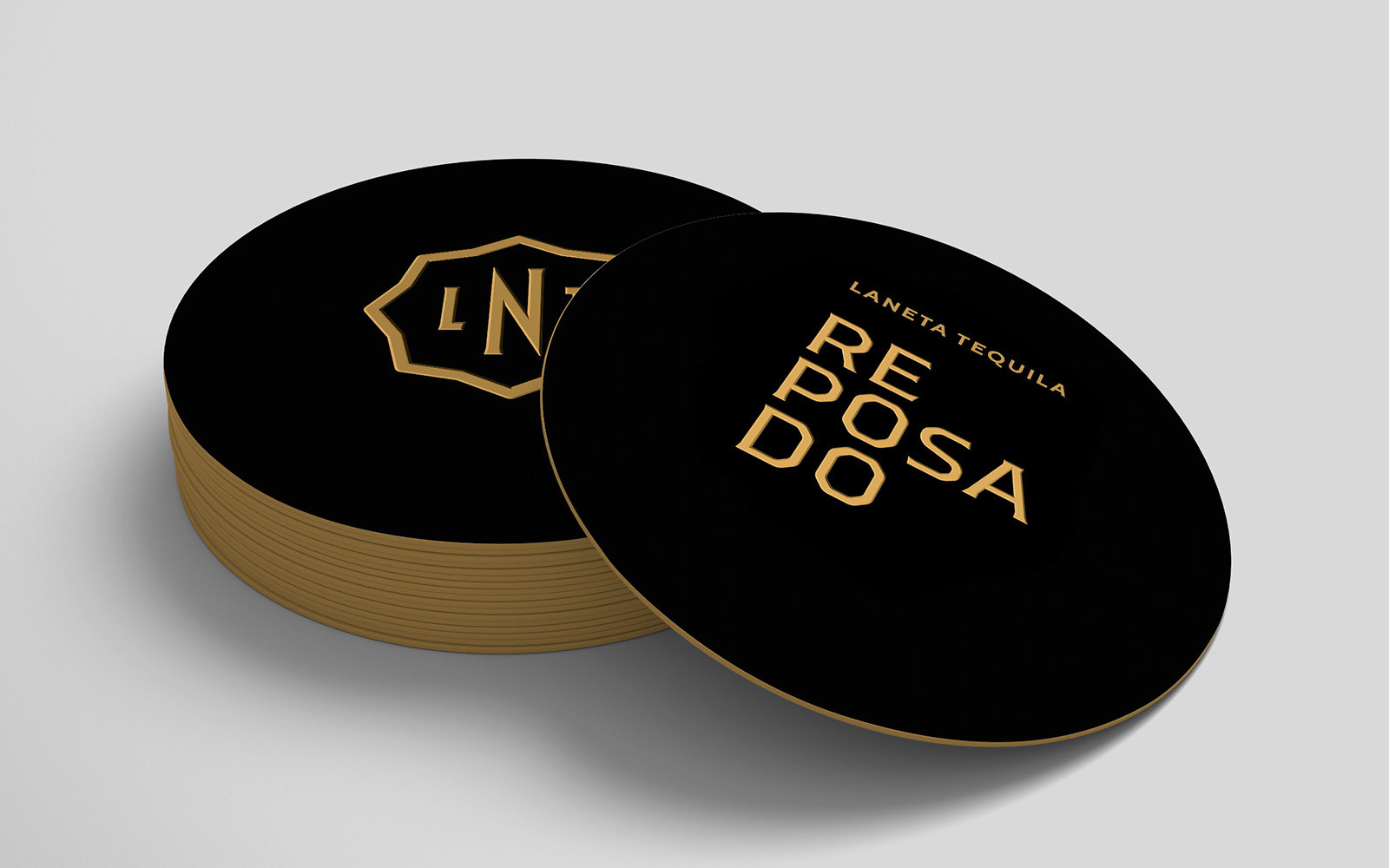
Premiums
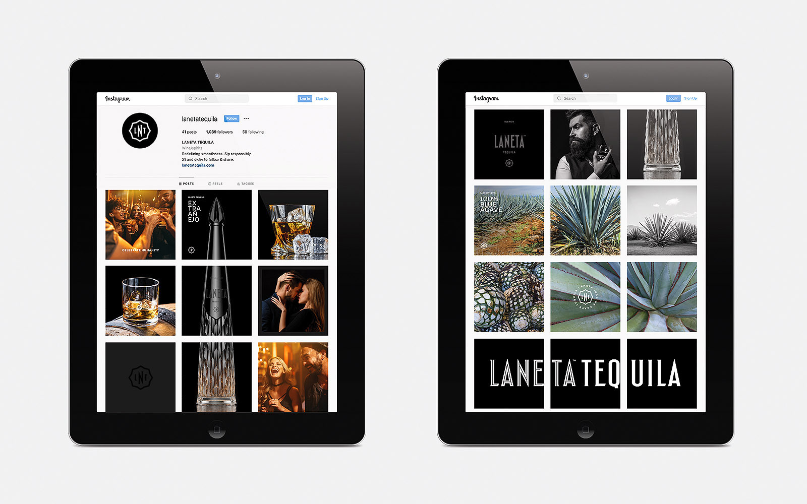
Instagram